I am sick of the color of Minnesota. Much of the state looks like the pond’s rim near here. Grasses, reedy, and six-feet tall. I hate it.
I know. I know. Being in an “environmental” mind gets you big marks these days. But I’m going a bit mad. Call it my March madness. Enough of the mud, the taupy browns, rested earth. Besides, the grasses and reeds are dead, anyway.
I think they would look better fashioned atop a tiki-hut on a beach, protecting the sunbirds from Minnesota who are currently escaping there. I would so appreciate its being repurposed in this way, especially while sipping on a Mai Tai with an umbrella-and-pineapple slice speared on a stir stick.
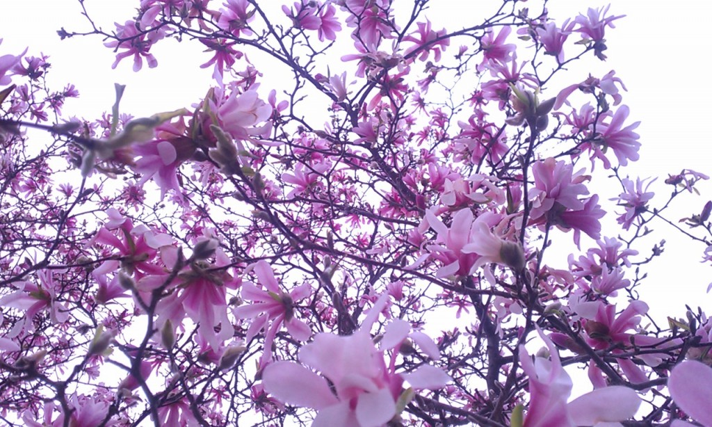
It’s time for the outside to have a new state of mind. Radiant orchid, the Pantone 2014 color of year would be just fine.
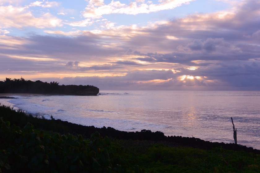
Hawaii, our fiftieth state has it down, as you can see from the sunrise at Shipwreck Beach in Poipu. I think it’s high time to follow its lead.
Here’s the color codes, Minnesota, in case you’ve forgotten how to get ready for spring.
Pantone: 18-3224;
CMYK: C-19, M-70, Y-0, K-0; RGB
HTML: B163A3
Here’s proof from 2013 that you can do it again, Minnesota!
About Julie Saffrin
Julie Saffrin is the author of numerous published articles and essays. Her latest book, BlessBack: Thank Those Who Shaped Your Life, explores the power of gratitude and offers 120 creative ways to journey toward positive, lasting change.


Home sick for Kauai? 🙂 I think I always will be too.
I am terribly homesick for Kauai. But, I will be back. I just know it. 🙂